
My Tableau project for the MBA Data Visualisation course (March 2026). I built an interactive dashboard story over every episode of The Simpsons: 36 seasons and 760 episodes, from December 1989 to March 2026. I then wrote an executive summary of what the data says to the people who run long-running shows.
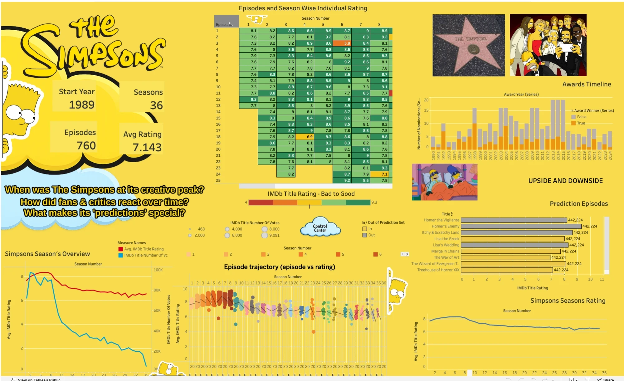
Explore the interactive dashboard on Tableau Public, or watch the walkthrough on YouTube.
1. What is the problem statement?
Everyone has an opinion on when The Simpsons "got worse", but opinions don't help anyone decide what to make, license or market. I wanted to turn 36 years of episodes into a story an executive could read in a few minutes, built around three questions:
- When did the show peak creatively?
- How did fan and critic reactions change over time?
- Why do its "predictions" of future events matter so much to its legacy?
The show's lasting value isn't its current output. It's the golden-age archive, the cast that never changed and how easily it turns into memes.
2. What are the tradeoffs considered?
- Every episode vs a clean trend. Season averages tell the story quickly but hide the great and terrible episodes. So the dashboard shows both: a heat map and a scatter plot of all 760 episodes, and a season overview line chart for the trend.
- Quality vs attention. A rating alone can't tell a weaker show apart from a smaller audience. I put the average rating and the number of votes on one dual-axis chart so both declines are visible together.
- Precise numbers vs a quick read. Coloured rating bands on the heat map let an executive spot good and bad seasons at a glance, at the cost of exact values. The exact rating is still there for anyone who explores further.
- A guided story vs free exploration. The story opens with KPI cards and the three questions, then walks through each view in order. Filters for season, prediction episodes and rating threshold let people explore on their own after that.
- Fun vs rigour on the "predictions". The prediction episodes are the part people share most, but most are coincidences or broad satire, and the list comes from fan wikis. I kept them as a separate, filtered view and presented them as a cultural and marketing effect, not as evidence.
3. What is the solution proposed?
A Tableau story built on IMDb ratings and vote counts, the Emmy Awards database, cast filmographies and a fan-compiled list of prediction episodes. It opens with four KPI cards (36 seasons, 760 episodes, a 7.14 average rating, first aired in 1989) and moves through seven views:
- Episode ratings heat map: every episode, season by season, coloured by rating.
- Season overview: the dual-axis chart of average rating against vote volume.
- Episode trajectory: a scatter plot of all 760 episodes by season and rating.
- Awards timeline: nominations and wins across 37 years.
- Prediction episodes: a filtered view of the episodes that seemed to predict the future.
- Cast and longevity: the core voice actors and how long they've stayed.
- Interactive filters: season, prediction episodes and rating threshold.
What the data showed:
- A golden age in seasons 3–8 (1991–1997). Average IMDb ratings sat around 8.2–8.7, against 6.5–7.0 from season 30 on. Season 8 was the high point, with several episodes rated 9.0 or higher.
- A decline in both quality and attention. Season 11 is where perception turned. Average ratings fell from 8.5 in season 8 to about 6.5, and votes per episode fell about 70% from their peak.
- A cast that never changed. Six core voice actors appear in all 760 episodes, including Dan Castellaneta as Homer and Julie Kavner as Marge. Award wins were concentrated in 1991–2000.
- Predictions as a viral engine. The prediction episodes get attention on social media that has nothing to do with how good the episode was.
From that I recommended:
- Production: limited-run "event" seasons instead of a new season every year, special episodes with classic-era creative teams, and curated "best of" collections for streaming.
- Business: license seasons 3–10 as hard as possible, use the prediction archive for social marketing, and test premium pricing for golden-age content on streaming.
- Audience: interactive tools that let fans explore the rating data themselves, and more focus on the cast's continuity as part of the brand.
4. Any other improvements I could have done?
- Use one set of colour breakpoints. The summary describes the heat-map bands in two slightly different ways. One documented scale, used everywhere, would make the dashboard easier to trust.
- Separate the drop in votes from how IMDb is used. Older episodes have had decades longer to collect votes. I'd normalise votes by years since airing, or add viewership data, before calling the drop "audience fatigue".
- Back up the engagement claims. The 3–4x engagement for classic seasons and the viral reach of prediction episodes deserve their own data, such as streaming views or social shares, not just ratings.
- Check the prediction list. It comes from fan wikis. A stricter rule for what counts as a prediction, with a source for each, would make that view more rigorous.
- Explain the decline, not just show it. Adding writer and showrunner changes to the timeline would test why quality turned around season 11.